How To Mix Patterns In A Room Without It Looking Busy
 By Lisa Ben
·
October 11, 2026
·
9 min read
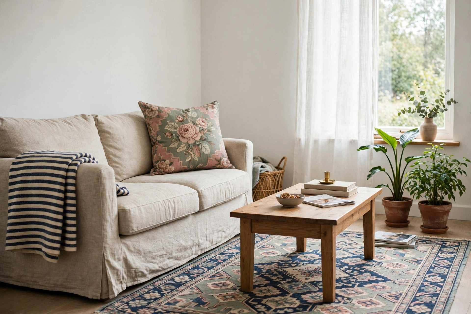
For years I kept my rooms pattern free because I was scared of them. One floral cushion would go on the sofa, look lovely in the shop and wrong by the time I got home, and go straight back in the bag. Meanwhile the rooms I saved pictures of, the ones that looked layered and lived in, were full of pattern. Stripes on florals. Checks next to prints. They were not braver than me. They were just following a recipe I had never been told.
Here it is, the whole thing, up front: pick one lead pattern, add one secondary pattern at a different scale, then add one small print, stripe or check that behaves like a solid. Keep all three inside one colour story, and leave roughly half the room plain. That is it. Everything below is just those five ideas explained properly, with the mistakes I made so you can skip them.
Rule one: one pattern leads, the rest follow
Every calm pattern mix has a boss. The lead pattern is usually the biggest piece in the room: a rug, a pair of curtains, a duvet cover, occasionally a very confident armchair. It gets the largest scale, the most colours, and the most square footage. Everything else in the room is hired to support it.
This is where most rooms go wrong before they even start. Two leads fight. A big busy rug under a big busy curtain does not look rich, it looks like two radios playing at once. So decide early. If you already own a patterned rug you love, the rug leads and the curtains stay quiet. If the curtains are the drama, the rug becomes plain or nearly plain. One star, supporting cast, no exceptions.
A practical point: the lead is also the piece you shop for first and spend the most time choosing, because its colours become the colour story for the whole room. Which brings us to scale, because scale is what lets the supporting cast join in without a fight.
Rule two: change the scale every time
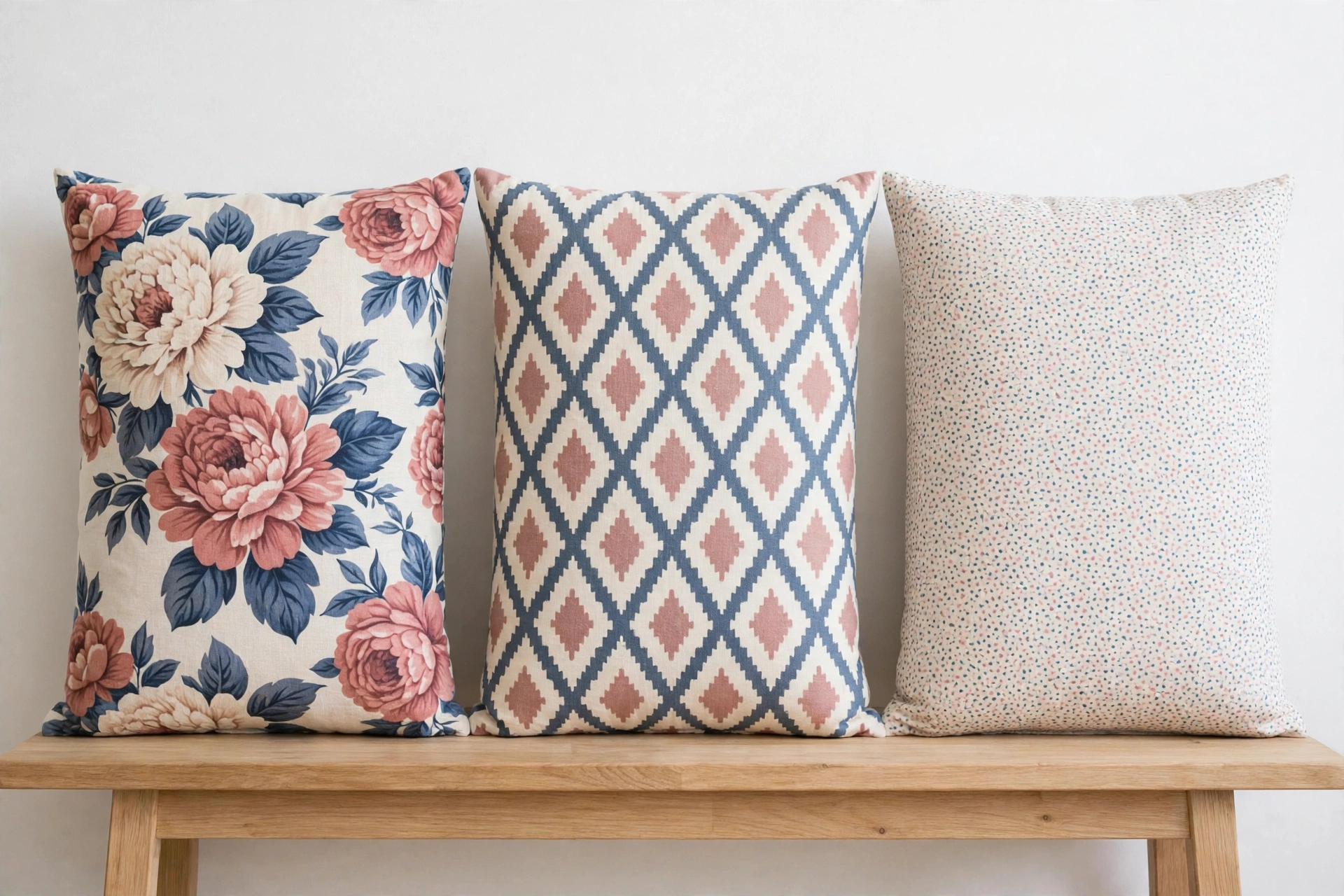
Scale is simply how big the pattern's repeat is. Once you see rooms in terms of large, medium and small, pattern mixing stops being mysterious. The rule: never put two patterns of the same scale next to each other. Two medium prints side by side blur into visual noise, because your eye cannot tell which one to look at. Spread them out, one large, one medium, one small, and the same eye reads them as layers instead.
So if the curtains are a large floral, the rug can be a medium geometric, and the cushions can be a small dot or a tiny stripe. If the rug is a large bold pattern, the cushions drop to medium and small. You are building a staircase, big to little, and every step down makes the room calmer.
The stripe and the check deserve a special mention here. A simple two colour stripe or a windowpane check reads almost like a solid from across the room, which makes it the easiest third pattern you will ever add. It gives the structure of pattern without the fuss. When in doubt, make your third pattern a stripe. It has never once let me down.
Rule three: one colour story holds it all together
Patterns can be as different as they like in style and scale. What they cannot do is ignore each other on colour. Pull two or three colours out of your lead pattern and repeat those, and only those, through every other pattern in the room. The floral has dusty rose, sage and a bit of navy in it? Then the stripe is navy and cream, the small print is sage on white, and the paint and plain pieces sit inside the same family.
Here is the part people miss: a colour your patterns have in common counts as glue even when it appears as a plain. If all three patterns sit on the same cream background, that cream is doing quiet work everywhere at once. It is why a cream sofa can hold a pile of mixed cushions together, and why white bedding makes checked and printed cushions look like a set instead of a jumble sale.
Watch out for the near match. Two blues that are almost the same but not quite will argue all day, far more than two blues that are clearly different. Either repeat a colour exactly, or move far enough away that the difference looks deliberate. Nearly right is the only wrong answer.
Solids are the rest stops
Patterns need somewhere for the eye to rest, and that somewhere is plain fabric. My rough rule is that about half of what you can see in the room should be solid: the sofa itself, a plain throw, the walls, the curtains if the rug is loud. It sounds like a lot until you look at the rooms you admire, and notice their sofas are almost always plain. The cushions do the pattern work. The big surfaces mostly do not.
Rest stops are also your cheapest fix. When a room feels busy, most people start removing patterns. Try adding plain first. One solid throw over the arm of a patterned chair, one plain cushion slipped between two printed ones, and the whole arrangement settles down without losing any of the fun.
Texture is a pattern that whispers
There is a fourth kind of pattern that never gets counted, and it might be the most useful one: texture. Linen weave, a jute rug, chunky knit, rattan, wood grain, a basket's weave. None of these read as pattern from the doorway, but up close they stop a plain surface from looking flat and dull.
This matters because texture gives you the layered feeling without spending any of your pattern budget. A room with one floral, one stripe, a jute rug and a linen sofa feels rich. Swap the jute for a third printed rug and the same room feels like a market stall. When a room needs more interest but cannot take more print, add texture and keep the prints where they are.
The doorway test
When you think you are done, stop decorating and start testing. Stand in the doorway, squint, and look at the room the way a visitor sees it in the first three seconds. Better still, take a phone photo from the door and look at the little screen instead of the room. Photos are ruthless. They flatten everything, and a mix that fights will fight twice as hard in a picture.
What you are checking for is simple. One pattern should clearly be the biggest presence. Your eye should travel around the room without snagging. If the photo looks like static, the usual culprit is two patterns at the same scale or two patterns of equal strength, and the fix is to swap one of them down a size or out for a solid. Do the test before you cut tags off anything.
Do it in this order: start with patterns you already own and lay them together on the sofa or the bed. Add one new pattern at a time, never two on the same day, and live with each addition for a full day before judging it. Half the mixes I thought had failed just needed me to stop staring at them for an hour.
Three combinations that earn their keep
If all of this still feels abstract, steal one of these. Each one follows the same recipe: a lead, a different scale, a stripe or check doing solid duty, and plain surfaces underneath.
Floral + stripe + plain
The classic, and the one in my living room right now. A large floral on the cushions or curtains leads. A striped throw or a striped rug at a medium scale supports it. The sofa stays plain, and the shared colours come straight out of the floral. It reads traditional without feeling stuffy, and it is nearly impossible to get wrong as long as the stripe is calmer than the flowers.
Geometric + plain + woven texture
The modern version. A medium geometric print on a rug or a pair of cushions does the talking. Everything upholstered stays plain, and the interest comes from texture instead of a third print: a woven throw, a jute or wool rug layer, wood with visible grain. Choose this one if prints make you nervous. It has the layered look with training wheels on.
Check + small print + wood and leather
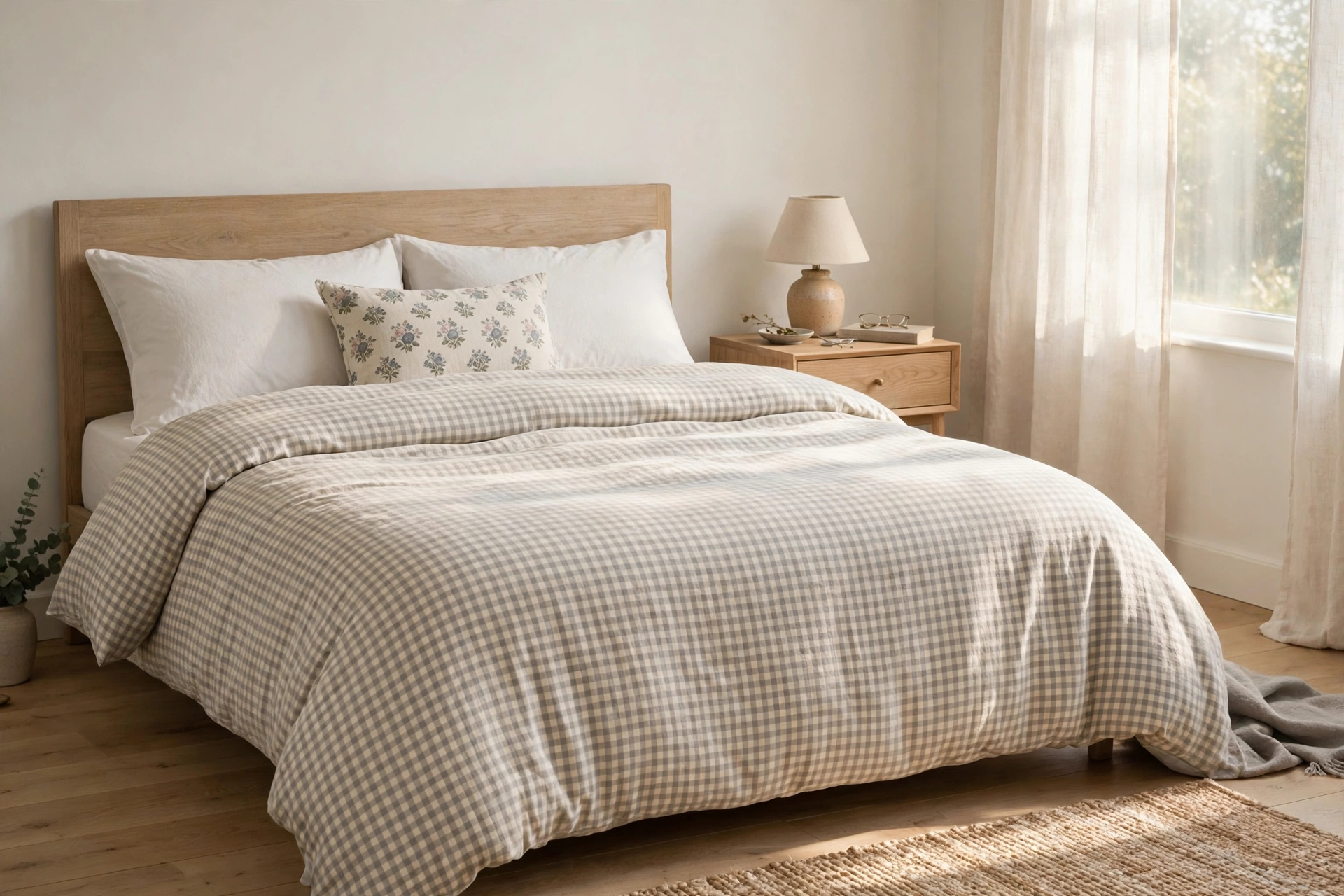
My favourite for bedrooms and anywhere cosy. A checked duvet cover or checked curtains lead at a large scale. One small print cushion, something ditsy and sweet, sits in front of plain pillows. Then warm wood and a bit of leather, a bedside table, a bench, a strap detail, ground the whole thing and keep it from going sugary. This is the mix on our bed at the moment, and it has survived two winters of me fiddling with it, which says a lot.
Where pattern mixing goes wrong
I have made every one of these, so this list is a confession as much as a guide.
- Two leads. A dramatic rug and dramatic curtains in the same room. Both lovely, together exhausting. Demote one to plain or to a stripe.
- Same scale neighbours. A medium floral cushion against a medium geometric cushion makes visual porridge. Change one size up or down and the problem vanishes.
- Colours that nearly match. The almost same blues, the cream that is not quite the other cream. Exact repeats or clear contrasts only.
- Pattern on every surface. Printed rug, printed curtains, printed cushions, printed lampshade, and then a whole ceiling of cushions across the sofa back as well. Count your patterned surfaces on one hand. If you run out of fingers, something goes plain.
- No rest stops. If there is nowhere plain for the eye to land, the room feels busy no matter how well the scales are mixed. Add solids before you subtract prints.
Questions I get asked about mixing patterns
How many patterns can one room actually hold?
Three prints is the sweet spot for most rooms, with texture on top of that. A big confident room can take four if the scales are all different and the colour story is tight. If you are new to this, stop at three and live there a while. You can always add. Crowded rooms nearly always started as three good patterns plus one impulse buy.
Can I mix two florals together?
Yes, if they are different scales and share colours. A large cabbage rose style floral with a tiny sprig print reads as lead and support. Two florals of the same size will fight, and florals in clashing colour stories will fight harder. When both are vintage in feel it helps too, because style agreement can carry what scale cannot.
What if my sofa is already patterned?
Then the sofa is your lead, and you work down the staircase from there: smaller scale cushions, a stripe or check as the third note, and everything else, rug, curtains, walls, kept plain or textured. A patterned sofa is not a problem. It is a head start, as long as nothing else tries to out sing it.
Do the patterns in the next room have to match?
They have to get along, which is a looser standard. If you can see one room from the other, repeat one colour across the doorway and the two spaces will feel connected without being twins. Patterns themselves can change completely. A floral living room opening onto a checked kitchen is fine, as long as the cream in both rooms is the same cream.
Start with the pattern you already love, give it one smaller friend and one stripe, keep the colours in the family, and leave half the room plain to breathe. Then take the doorway photo and trust it more than you trust your nerves. Tell me in the comments which pattern is sitting in a bag at your house right now, waiting for courage. We will find it a supporting cast.
Lisa Ben
Lisa paints, builds, thrifts and rearranges her way through one very patient house, then writes down everything she learns here on Wazala. Pattern mixing took her years to stop fearing and about one afternoon to learn. New projects land every Tuesday, Thursday and Saturday, and the Sunday Letter rounds them up once a week.
You might also like
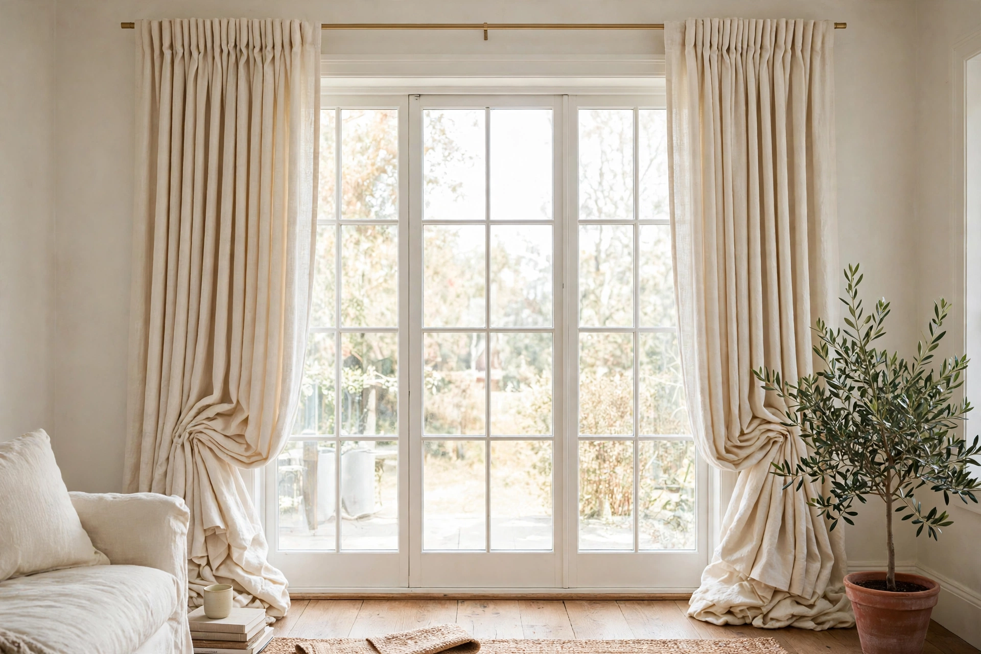
How To Hang Curtains High And Wide (So Windows Look Bigger)
Where the rod really goes, how long curtains should be, and the measuring mistakes to skip.
Read more →
Rug Sizes That Actually Work, Room By Room
The rug sizes that make furniture look settled instead of stranded, with the front legs rule explained.
Read more →
Small Living Room Layouts: 6 Arrangements For Tight Spaces
Six layouts for small rooms, with the walkway measurements that make each one work.
Read more →