Every Paint Colour Of The Year, And Which Ones Still Work
 By Lisa Ben
·
October 20, 2026
·
10 min read
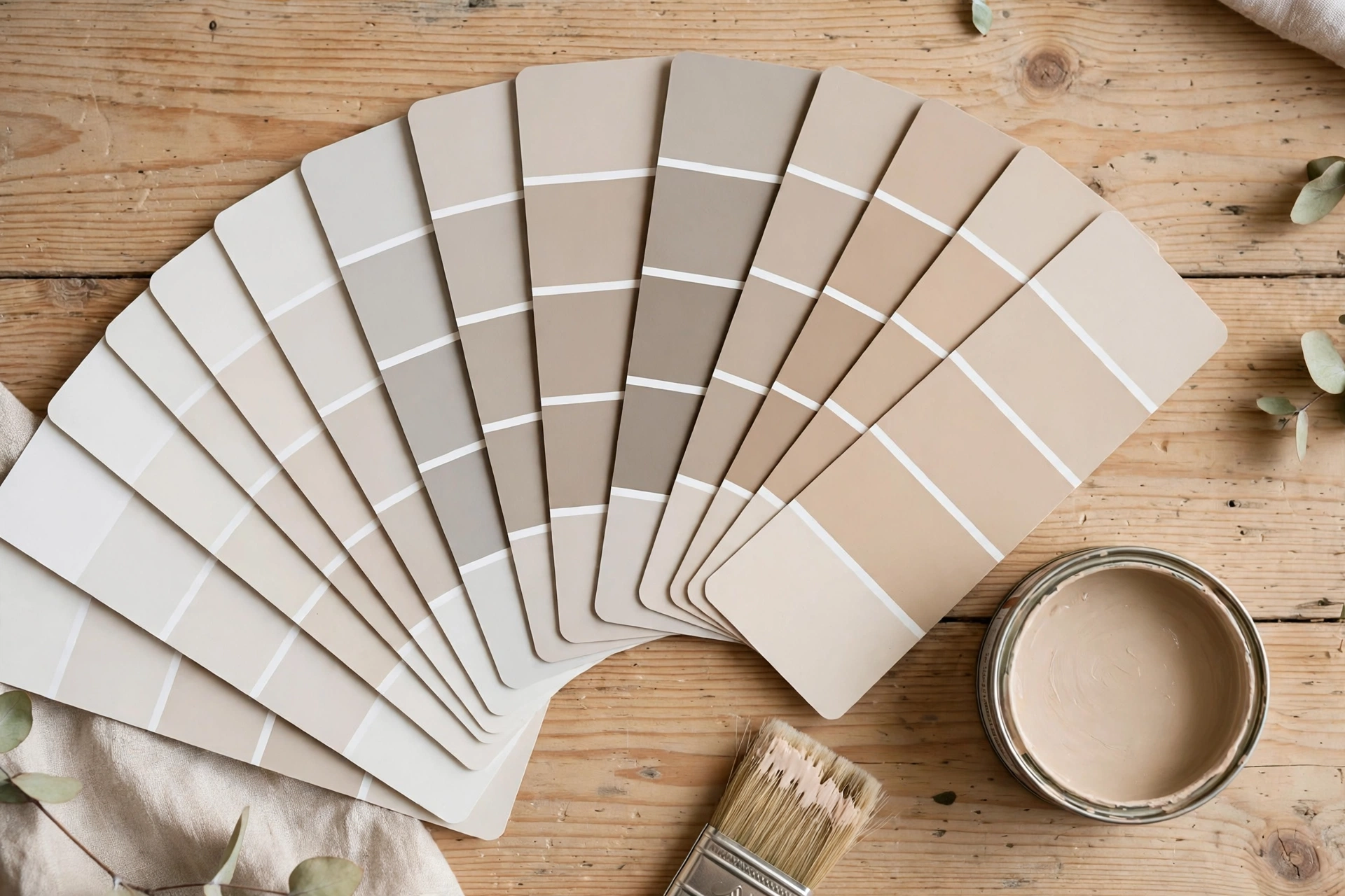
Every autumn, right on schedule, the big paint brands announce a Colour of the Year. There is a press release, a moody photo shoot, and about forty blog posts (mine included, in past years) saying this is the shade your living room has been waiting for. Then the next autumn arrives, a new colour takes the crown, and last year's pick is left on your walls to fend for itself.
So let us do the honest version. I went back through the recent picks from Benjamin Moore, Sherwin-Williams and Pantone, the ones from 2019 to 2025, and asked a simple question of each one: would I still put this on a wall today, in a real house, with real furniture? Some of these colours have aged beautifully. A couple look pinned to their year like a timestamp. Here is the whole list, the quick verdicts first, then the longer story in three groups.
The quick verdict
Short on time? This table is the whole post in one screen. Yes means I would still use it happily. The notes get more specific in the sections below.
| Year | Brand | Colour | Still works? |
|---|---|---|---|
| 2025 | Benjamin Moore | Cinnamon Slate 2113-40 | Yes, a plum-grey that behaves like a neutral |
| 2025 | Sherwin-Williams | Colour Capsule: Grounded SW 6089, Quietude SW 6212 | Yes, both are quiet, wearable colours |
| 2025 | Pantone | Mocha Mousse 17-1230 | Mostly, if your room suits warm brown |
| 2024 | Benjamin Moore | Blue Nova 825 | Yes, especially on cabinets and doors |
| 2024 | Sherwin-Williams | Upward SW 6239 | Yes, a soft blue that acts like a neutral |
| 2024 | Pantone | Peach Fuzz 13-1023 | In small doses, it dates fast on big walls |
| 2023 | Benjamin Moore | Raspberry Blush 2008-30 | One wall or one piece of furniture, not four walls |
| 2023 | Sherwin-Williams | Redend Point SW 9081 | Yes, a warm blush-beige that flatters rooms |
| 2023 | Pantone | Viva Magenta 18-1750 | Accents only, it shouts |
| 2022 | Benjamin Moore | October Mist 1495 | Yes, one of the easiest greens ever sold |
| 2022 | Sherwin-Williams | Evergreen Fog SW 9130 | Yes, the quiet winner of the whole list |
| 2022 | Pantone | Very Peri 17-3938 | Carefully, a little goes a long way |
| 2021 | Benjamin Moore | Aegean Teal 2136-40 | Yes, still the cabinet colour to beat |
| 2021 | Sherwin-Williams | Urbane Bronze SW 7048 | Yes, on doors, cabinets and whole moody rooms |
| 2021 | Pantone | Ultimate Gray + Illuminating | The grey, yes. The bright yellow, sparingly |
| 2020 | Pantone | Classic Blue 19-4052 | Yes, navy never really left |
| 2019 | Pantone | Living Coral 16-1546 | The dated one. Lovely colour, wrong decade feel |
The quiet neutrals that still work everywhere
Start with the colours nobody writes dramatic headlines about, because they are the ones still earning their keep. Evergreen Fog SW 9130 (Sherwin-Williams, 2022) is a soft, greyed sage green, and I would call it the most successful pick on this entire list. It changes gently through the day, sits happily next to wood, white and black, and works in bedrooms, living rooms, hallways and kitchens without ever looking like a theme. If a colour of the year had to prove the concept, this is the proof.
October Mist 1495 (Benjamin Moore, 2022) is its close cousin: a silvery sage that reads a touch cooler and calmer than Evergreen Fog. It is the one I suggest to people who want green but are frightened of green, because in most light it behaves like a neutral with a personality. Then there is Urbane Bronze SW 7048 (Sherwin-Williams, 2021), the deep bronze-brown that launched a thousand painted doors. It is nearly black in low light, warm brown in sun, and it still looks expensive on front doors, kitchen islands and study walls. Dark colours date slowly, and this one has barely aged a day.
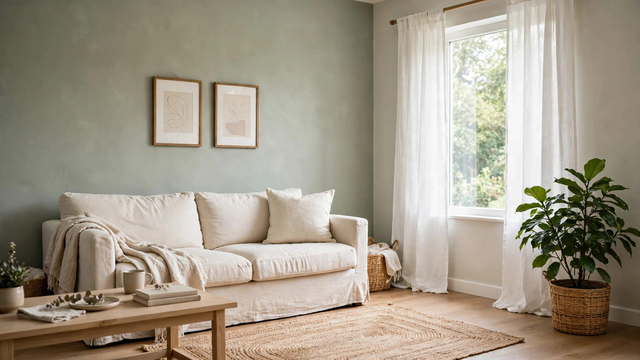
Sherwin-Williams did something different for 2025: instead of one colour, they announced a Colour Capsule, a small family of shades meant to be used together. The two worth knowing are Grounded SW 6089, a warm, earthy brown that makes a room feel held, and Quietude SW 6212, a hushed green-grey with a blue whisper in it. Both are exactly the sort of colour that survives trends, because neither one is trying to be the loudest thing in the room. A capsule is a quieter kind of announcement, and honestly a more useful one.
One more neutral deserves its line: Ultimate Gray, half of Pantone's two-colour 2021 announcement. Mid grey walls had already peaked by then, so it felt late on arrival, but as a colour it is faultless: concrete-toned, calm, and still the backdrop half the internet uses. Its partner, Illuminating, a bright lemon yellow, is an accent colour only. A cushion, yes. A wall, no, and it never really was.
A quick note on trim, because it decides whether these neutrals look current or tired. Pair the sage greens and the warm browns with a soft white, something like White Dove or Alabaster from my white paint guide, rather than a bright blue-white. Stark trim is what made a lot of 2010s colour schemes look hard, and the gentler whites are a big part of why the same wall colours feel calmer now. Ceilings can stay plain white; nobody in the history of houses has been judged for a white ceiling.
The blues and teals: still strong, with addresses
Blue is the safest strong colour there is, which is why the blue picks have aged better than the loud ones. Aegean Teal 2136-40 (Benjamin Moore, 2021) is a deep blue-green that landed right when everyone was painting kitchen cabinets, and it has not been beaten since. On cabinets, vanities and bookshelves it looks rich without going dark, and it pairs with brass and warm wood like they were designed together. Whole rooms in it are moodier: doable in a study or a small loo, heavy in a north-facing living room.
Blue Nova 825 (Benjamin Moore, 2024) is the violet-leaning cousin, a mid blue with a softness that keeps it friendly. It is lovely in bedrooms, where the violet base turns it restful, and on a front door it is the one neighbours ask about. Upward SW 6239 (Sherwin-Williams, 2024) goes the other way: a pale, breezy blue that is close enough to neutral to cover four walls without a second thought. Nurseries and bathrooms took it up first, but I have seen it in a hallway and it simply felt like good weather.
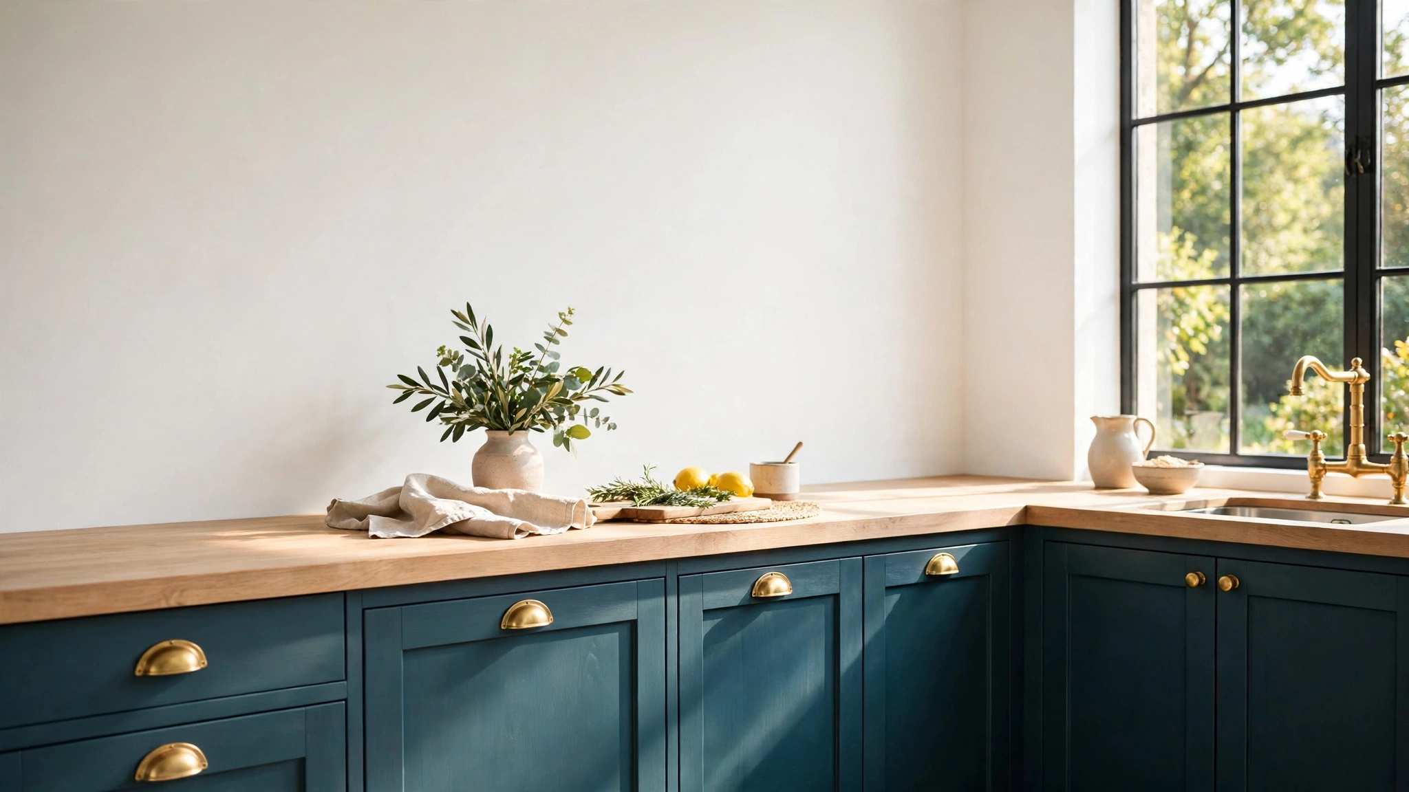
Pantone's Classic Blue 19-4052 (2020) is the plainest name on the list and the most timeless colour: a straight, true navy. Navy was a classic long before 2020 and will be one long after, which almost feels like cheating, but it proves the point of this post: the picks that last are the ones that were never really trends. The one blue-family colour to handle with care is Very Peri 17-3938 (Pantone, 2022), a periwinkle violet-blue mixed specially for its year. It is pretty, and it is unmistakably early-2020s. Use it the way it survives best: a painted stool, a bedroom accent wall in a house that loves colour, a front door on a street that can take it. Four walls of Very Peri will tell visitors exactly when you decorated.
The bold ones: use it on one thing, not four walls
Now the colours that arrived with fireworks. Raspberry Blush 2008-30 (Benjamin Moore, 2023) is a coral-red with real voltage, and Benjamin Moore knew it: their own photos showed it on dining room walls with the lighting doing half the work. In an ordinary room with ordinary light, four walls of it is a commitment very few people keep. But on one thing it is glorious: a bathroom vanity, a kitchen island, the inside of a bookcase, a front door. A saturated colour used once reads as confidence. Used everywhere, it reads as its year.
Viva Magenta 18-1750 (Pantone, 2023) is the same lesson in a deeper voice. It is a crimson-pink with genuine drama, and it survives now in velvet chairs, cushions, art and the occasional very brave powder room. Living Coral 16-1546 (Pantone, 2019) is the one pick I would call truly dated, and it is not the colour's fault. Coral got matched to death in 2019: coral cushions on grey sofas, coral throws, coral everything, in the same rooms as grey walls and silvered wood. The pairing is what expired. The colour itself, used freshly against white, natural wood and green plants, still feels summery and kind. If you love it, rescue it from its 2019 outfit rather than retiring it.
The gentle end of this group has aged better. Peach Fuzz 13-1023 (Pantone, 2024) is a soft peach that works in bedrooms as a warm near-neutral, though it sweetens fast in sunny rooms. Mocha Mousse 17-1230 (Pantone, 2025) is a light, warm brown, and it arrived right as brown came back from the cold; on walls it reads like a hug, especially with cream and black accents. Cinnamon Slate 2113-40 (Benjamin Moore, 2025) mixes plum and brown-grey into something that shifts through the day and behaves far more quietly than it sounds. And Redend Point SW 9081 (Sherwin-Williams, 2023), a blush-beige with clay in it, turned out to be the stealth neutral of its year: warm, flattering, and still completely usable on four walls.
My rule for the strong ones: paint the smallest version of the idea first. A door, a vanity, a single chair, the back of a shelf. Live with it for a month. If you keep smiling at it, the colour has earned more wall. If you are quietly relieved it is only on the door, you have your answer for the price of a sample pot.
How to use an older colour of the year without dating the room
Notice what actually dates a room: rarely the colour alone. It is the colour plus the whole matching outfit it arrived with. Coral with grey everything said 2019. Ultraviolet-style purples with chrome and glass said 2018. The fix is to keep the colour and change the company it keeps.
Three moves that work. First, shrink the dose: a dated shade in a small amount stops being a theme and becomes an accent. Second, pair it with current neutrals: warm whites, natural wood, unlacquered metals and the grey-greens from the top of this list all pull an older colour into the present, because the eye reads the newest-looking thing in the room first. Third, remove the matching trend accessories: the cushion set, the print and the rug that were sold as a look with that colour are what pin it to its year. Swap those for things in other colours and textures, and the wall colour suddenly looks like a choice again instead of a leftover.
One more lever people forget: light and finish. A colour that looked right under the warm bulbs of its launch photos can sulk under cold white LEDs, so before you repaint anything, try bulbs in the 2700 to 3000K range and see the room again. Sheen matters too. The same shade in flat matt reads softer and more modern than it did in the satin finish everyone used a few years back, and dropping a dated colour down to matt is the cheapest refresh there is. I have "repainted" a room twice now by changing nothing but the bulbs and the finish, and both times guests asked what the new colour was.
The pattern, once you line them all up
Line up five years of winners and the pattern is hard to miss. Every pick that still works is a liveable mid-tone: sage greens, warm browns, soft blues, deep teals, colours with some grey or earth in them to calm them down. Every pick that dated was either very bright, very sweet, or sold with a whole matching look attached. Paint companies need a headline every autumn. Your walls need to be lived with for five years. Choose like the second one, and the headlines can look after themselves.
And if next autumn's announcement tempts you, and it will tempt me too, run it through the same filter before you buy a tin: does it have grey or earth in it to calm it down, does it suit the light in your actual room, and would you still pick it if nobody had called it anything special? Three yeses and you are probably looking at a keeper.
Questions I get asked about colour of the year paints
Is it a mistake to paint with a colour of the year?
No. It is a mistake to paint with one just because it was announced. Treat the lists as a well-funded shortlist: the brands spend real money testing what people respond to. If a pick also suits your light and your furniture, it being fashionable is a bonus, not a problem. Evergreen Fog is fashionable and timeless at the same time.
Which single pick should I choose if I only buy one tin?
Evergreen Fog SW 9130 for walls, because it flatters the widest range of rooms and light. If you want one adventurous tin instead, make it Aegean Teal 2136-40 and put it on cabinets, a vanity or a door, where its depth earns its keep.
My walls are a dated colour of the year. Do I have to repaint?
Only if the colour itself bothers you. If you still like it, change the room around it first: new cushions and art in different colours, warmer light bulbs, some natural wood. Most "dated" rooms are dated by their accessories. Repaint when the wall colour itself feels wrong at midday, not when a magazine moves on.
Can I get these exact colours mixed by another brand?
Usually, yes. Most paint counters can match a named colour from a swatch or a code, and the result is close. It is rarely perfect though, because bases and pigments differ, so always test the matched version on a board in your room, the same as you would the original.
So, the short version: the greens and the deep teals never left, the blues are safe in the right rooms, and the loud pinks and corals just need a smaller stage and better company. Tell me in the comments if you painted with one of these in its big year, and whether it is still on your walls. I am keeping score.
Lisa Ben
Lisa paints, builds, thrifts and rearranges her way through one very patient house, then writes down everything she learns here on Wazala. She has strong opinions about colour announcements and keeps every swatch card she has ever bought. New projects land every Tuesday, Thursday and Saturday, and the Sunday Letter rounds them up once a week.
You might also like
The 12 Best White Paint Colours For Every Light Direction
Twelve whites sorted by the light your room actually gets, with codes and undertones.
Read more →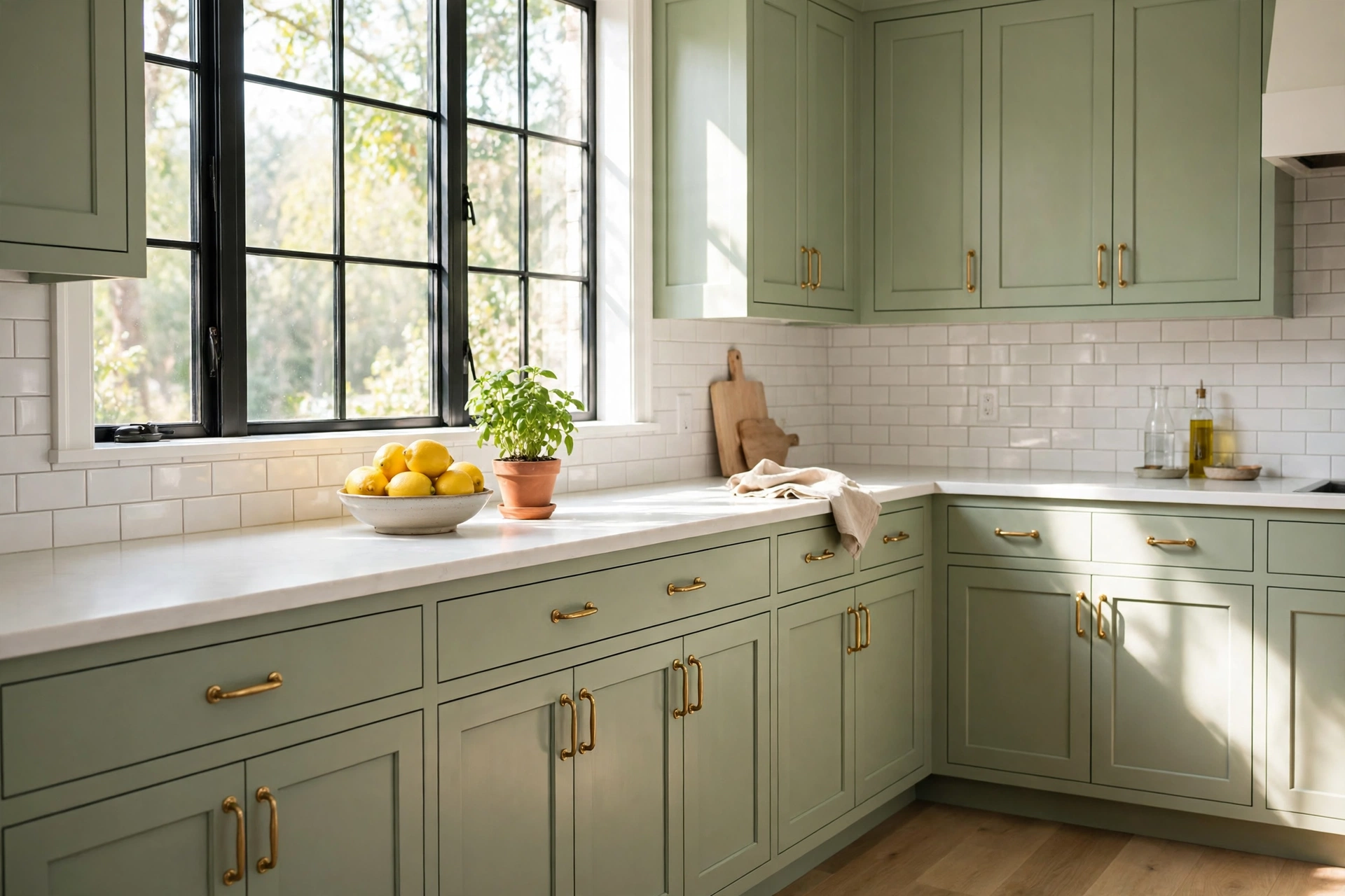
How To Paint Kitchen Cabinets And Have The Finish Last
The full cabinet process: degreasing, priming, and the drying times nobody tells you.
Read more →
The 9 Best Greige Paint Colours, With Undertones Explained
Grey meets beige: the in-between colours that work in almost any light.
Read more →