How To Pick The Right Paint Finish (And Why The Wrong One Looks Cheap)
 By Lisa Ben
·
October 6, 2026
·
11 min read
The worst paint job in my house was not a bad colour. It was a beautiful soft white in full gloss, rolled onto my hallway walls because the tin was already open and I did not want to waste it. In daylight the hall looked like the inside of a fridge. Every ripple in the plaster threw a highlight, every brush mark showed, and you could watch your own reflection wobble past the coat hooks. Same colour as the calm matt bedroom next door. Completely different room.
That is the thing about finish. People spend weeks choosing a colour and about ten seconds choosing the finish, usually by copying whatever the last tin happened to be. Yet finish changes how a colour reads, how a room feels under lamps at night, how often you end up repainting, and whether your walls forgive your plastering or announce it to everyone. Pick it on purpose and an ordinary colour looks expensive. Pick it by accident and a lovely colour looks cheap. Here is how I choose, room by room.
What "finish" actually means
Finish is just the trade's word for shine. It describes how much light the dried paint bounces back at you. Flat paint scatters light in every direction at once, so you see the colour itself and not much else. Glossy paint bounces light straight back, the way a mirror does, so you see reflections, highlights and the exact shape of the surface underneath. Eggshell, satin and semi-gloss sit on the ladder between those two ends.
Two practical things ride along with shine. The more sheen a paint has, the harder and more sealed its dried surface tends to be, so it shrugs off knocks and wipes clean more easily. The flatter a paint is, the kinder it is to imperfect walls, because scattered light draws no outlines around bumps. Nearly every finish decision comes down to that one trade: toughness versus forgiveness. Keep it in mind and every recommendation below makes sense.
The five finishes, from flattest to shiniest
Matt / flat
Matt, called flat on some tins, has almost no shine at all. It gives that chalky, velvety look all over the interiors magazines, and it is the most forgiving finish there is: lumps, hairline cracks and wobbly plaster all but vanish under it. The price is toughness. Ordinary matt marks when a chair scrapes it, and it can burnish, going shiny in patches, if you scrub at a stain. Modern washable matts are far better than the old stuff and most of my walls wear one, but a basic matt in a busy hallway will look tired within the year.
Eggshell
Eggshell has the faintest glow, like the surface of, yes, an eggshell. It is a small step up from matt in durability and a small step down in forgiveness, which makes it the great compromise finish. On walls it reads as flat in most light but has a softness that plain matt lacks, and on woodwork and furniture it gives a low, smart sheen that looks painted rather than plastic. If you forced me to decorate a whole house in a single finish, this would be it.
Satin
Satin reflects noticeably more light, with a smooth, mid-level sheen. It wipes clean properly, stands up to steam and sticky fingers, and it is the finish most people actually want in kitchens, bathrooms and on doors, whether or not they know its name. On big walls it is less forgiving than eggshell: decent plaster looks fine, but tired plaster starts telling its story. Keep satin walls for rooms that earn it through water, grease or heavy traffic.
Semi-gloss
Semi-gloss is properly shiny. It is hard, close to waterproof in spirit, and scrubs clean without complaint, which is why it turns up on rental woodwork, school corridors and bathroom ceilings. In a home it is a specialist. Brilliant on a front door or a piece of furniture you want to look almost lacquered, harsh on walls. Under semi-gloss, every trowel mark and filled crack stands up and introduces itself. Reach for it when the surface is smooth and the job is hard-wearing, not before.
Gloss
Gloss is the mirror end of the ladder: the highest shine and the toughest skin of the lot. On a well-prepared front door or a set of drawers it looks wonderful, deep and deliberate, like enamel. On anything less than perfectly flat it is merciless. Gloss also asks the most of you as a painter, because it shows brush marks and dust specks that flatter finishes politely hide. It has largely fallen out of fashion for whole rooms, and honestly, the rooms are better for it.
| Finish | Sheen | Wipes clean? | Hides wall flaws? | Best for |
|---|---|---|---|---|
| Matt / flat | None, chalky | Poorly (washable versions: well) | Brilliantly | Living rooms, bedrooms, ceilings |
| Eggshell | Faint glow | Fairly well | Very well | Walls anywhere, woodwork, furniture |
| Satin | Soft shine | Well | Fairly | Kitchens, bathrooms, halls, doors |
| Semi-gloss | Noticeable shine | Very well | Poorly | Front doors, hard-wearing woodwork |
| Gloss | Mirror-like | Best of all | Not at all | Perfectly smooth doors and furniture |
Why shiny paint shows every bump and brush mark
Stand beside a window in the late afternoon and look along a wall rather than at it. That sideways light is called raking light, and it is the truth-teller of decorating. On flat paint, the light scatters, so a bump casts no real shadow and your eye slides straight past it. On a shiny finish, the surface works like a row of tiny mirrors. A bump tilts its mirrors, catching a bright highlight on one side and a dark line on the other, and your eye reads that contrast as shape. The wall has not changed at all. The finish has simply started reporting on it.
The same goes for your own work. Brush strokes, roller texture and one slightly heavy edge all sit on the surface, and shine outlines every one of them. This is why a wavy old wall in gloss looks cheap however expensive the paint was, and why the prep you can skim under matt, the filling, the sanding, the proper undercoat, is not optional under anything shinier. Shine is an amplifier. It makes good work look better and rough work look worse, at exactly the same volume.
Room by room: the finishes I actually use
Living rooms and bedrooms: matt or eggshell
These are the rooms where walls mostly get looked at, not scrubbed, so forgiveness wins. Matt if the plaster is old, the light rakes across it from a side window, or you want that soft chalky depth behind a sofa. Eggshell if there are children, dogs or a wood burner adding their signatures, because it wipes without burnishing as quickly. I use a washable matt in our living room and eggshell in the bedroom, and the difference is small enough that guests never spot it, which is rather the point.
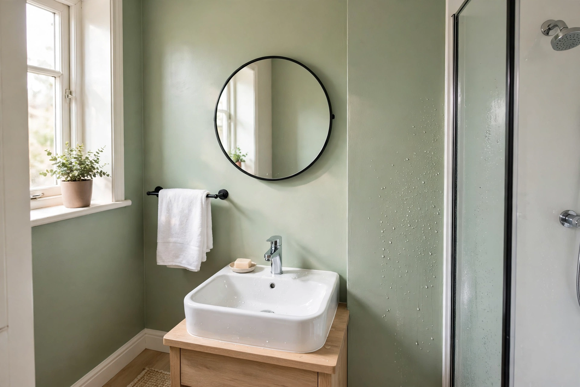
Kitchens and bathrooms: a washable mid-sheen
Water changes the vote. Steam, splashes and cooking grease all punish flat paint: it stains, it holds onto smells, and constant damp can feed mould on the surface. A mid-sheen is the answer here, satin or a good eggshell on the walls, ideally from a paint sold specifically for kitchens and bathrooms. That category exists for a reason. Those paints are made to resist moisture and to carry mould-resistant ingredients, so look for the words on the tin instead of assuming any old satin will do. Behind the hob and around the bath, I want a finish I can wipe down weekly without it going patchy.
Hallways and stair walls: eggshell at the very least
The hallway is where walls go to be knocked. Bags, bikes, school shoes, the corner of every picture frame you ever carry upstairs: it all lands at hand height along the stairs. Dead matt here is a false economy, because you will be touching it up forever. Eggshell at the very least, satin if your household is busy, and keep the leftover paint labelled in the cupboard, because a touch-up in the right sheen disappears while one in the wrong sheen shows as a dull or shiny patch forever. Skirting and a dado rail in satin take the worst of the knocks and quietly save the walls above them.
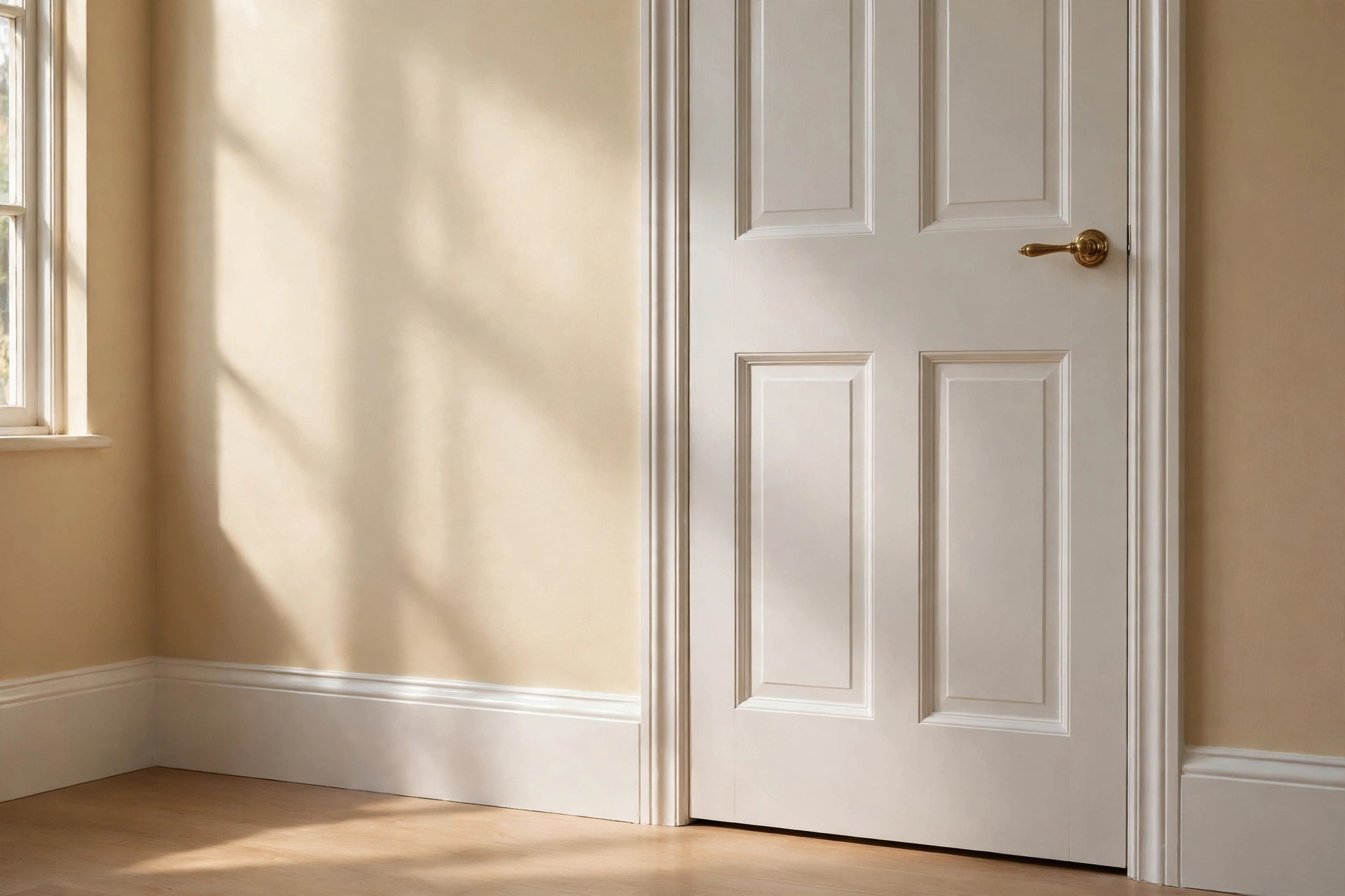
Woodwork and doors: the satin versus gloss argument
Doors, skirting and architraves traditionally wore gloss, because it was the hardest finish going and white woodwork framed a room like a mount frames a picture. The modern argument is satin versus gloss. Satin looks softer and more current, hides a multitude of sins in old timber, and is what I reach for on almost all our woodwork now. Gloss still wins on a smart front door or a formal staircase, anywhere you want that deep enamel shine and the wood underneath is genuinely smooth.
One honest warning before you choose gloss for inside: old-style oil-based gloss yellows as it ages, and it yellows fastest in rooms with little daylight, because daylight is part of what keeps it white. A glossed door in a dim hallway can turn distinctly creamy within a couple of years. Water-based gloss and satin paints yellow far less, at the cost of a slightly less mirror-like finish. For most homes, that trade is worth it.
Ceilings: flat matt, with one exception
Ceilings want flat matt, full stop. A ceiling is the biggest and least perfect surface in the room, lit at the worst possible angle, and any shine up there turns every joist line and plaster wave into a feature you never asked for. Flat matt also pushes the ceiling visually away from you, which makes the room feel taller. The one exception is the bathroom, where a washable matt or a kitchen-and-bathroom paint handles the steam far better than a bargain ceiling paint that goes mouldy at the edges.
Furniture: eggshell and satin do the work
On furniture, finish is half the design. Eggshell and satin are the workhorses: enough sheen to look finished, not so much that every brush stroke shows across a drawer front. Chalk-style paints sit even flatter than matt and suit that soft, layered look, but they need wax or varnish over the top or every coffee ring becomes a permanent resident. Gloss on one small piece, a side table or a stool, can look like lacquer and is great fun. Gloss over a whole dresser means a weekend of sanding between coats, which I have done exactly once and do not plan to repeat.
The cheap-look traps
Three traps account for nearly every "why does this look cheap?" message in my inbox, and a quiet fourth shows up in rental flats everywhere.
Shine on a wavy wall. Gloss, and usually even satin, on plaster that rolls like the sea. The colour is lovely, the wall is not, and the shine draws a map of every bump. Drop two rungs down the ladder to eggshell or matt and the same wall looks twice as good for no extra money.
Dead matt in a splash zone. Around a sink or a hob, flat paint drinks every droplet and grease spot until the wall grows a grubby halo that no amount of wiping shifts, because the wiping itself polishes shiny patches into the matt. The wall ends up looking dirty even when it is clean. Move the finish up a rung instead of scrubbing harder.
Two sheens fighting on one wall. A satin touch-up over matt, or a gloss patch on eggshell. The colour matches perfectly and the patch still shouts from across the room, because your eye catches a change in shine long before a change in colour. If you must patch, feather the edges well, and accept that a big patch means redoing the whole wall in one finish.
Semi-gloss living rooms. Usually a landlord legacy. The room feels cold and faintly institutional however nice the furniture is, because the walls behave like wipe-clean corridor walls. One coat of washable matt over the top is the cheapest transformation on this whole page.
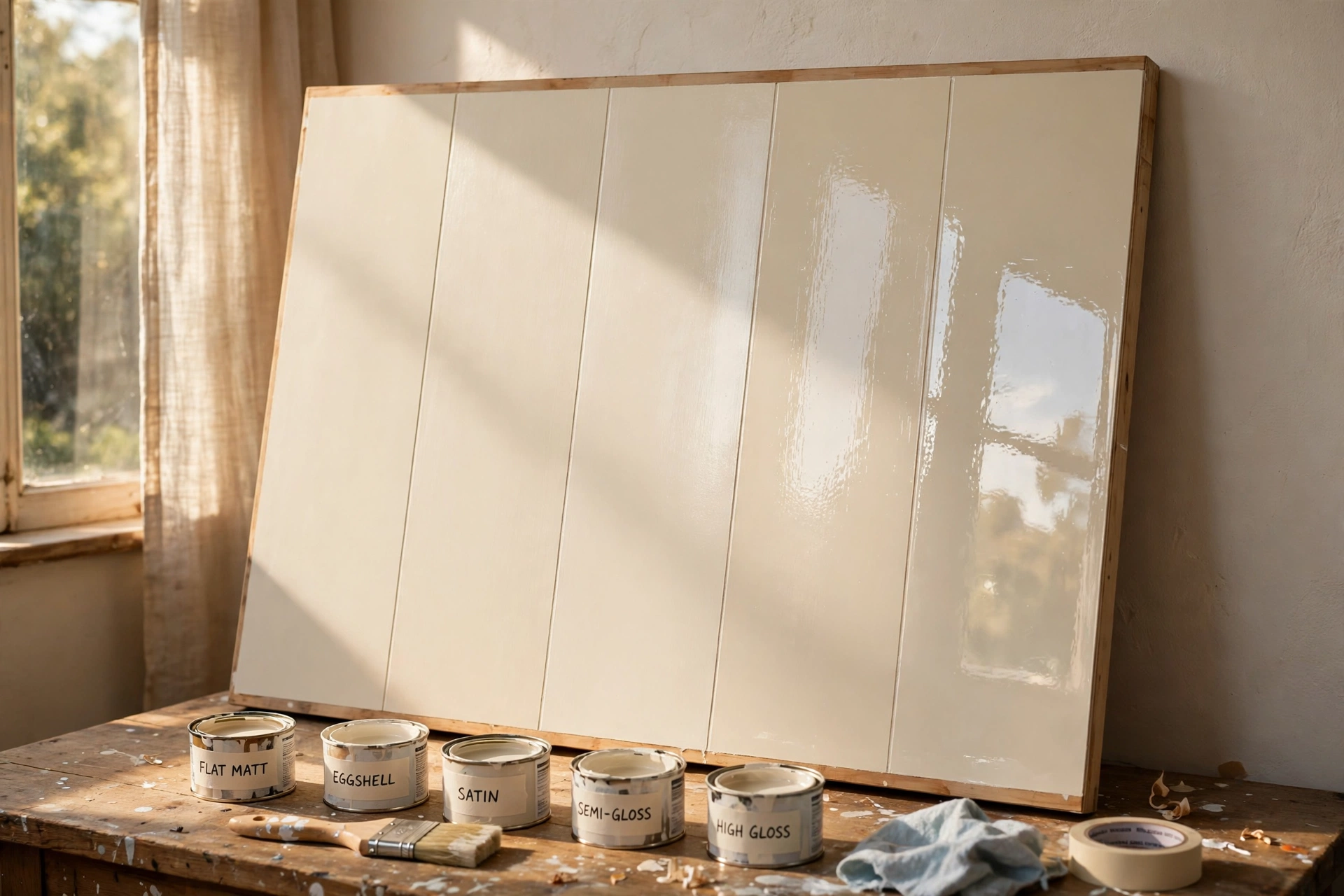
How to test a finish before you commit
Colour gets all the testing advice, but finish needs a sample too, because a swatch card tells you precisely nothing about shine. Paint your shortlist finishes in bands side by side on a board, or on the back of a spare roll of lining paper, all in the same colour. Then do the one thing hardly anybody does: tilt it. Hold the board at a low angle to the window and rock it slowly. The bands will flash one after another as the light catches them, and you will see exactly how much shine each finish brings into your room's real light.
Then lean the board against the wall you are painting and live with it for a full day, lamplight included, because finishes look calm at noon and noticeably shinier at night. Finally, give the shiniest band a wipe with a damp cloth and a drop of washing-up liquid. That is its job interview. The finish that still looks good after all three tests is your finish, and it is worth the price of one sample pot to learn that before the big tin comes home.
The rule I paint by: walls as flat as the room's life allows, woodwork one rung shinier than the walls, ceilings as flat as the tin goes. It has never once steered me wrong.
Questions I get asked about paint finishes
Can I just use one finish everywhere?
Nearly. Eggshell comes closest to an all-rounder: walls, woodwork and furniture all look right in it, and plenty of calm, colour-drenched rooms are painted exactly that way. The two places I would still break the rule are ceilings, which really do want to stay flat, and steamy bathrooms, which earn a dedicated kitchen-and-bathroom paint. One finish everywhere else will not hurt a thing.
Is matt paint washable these days?
The good stuff, yes. Paints labelled washable or durable matt are made to survive a proper wipe and a gentle scrub without burnishing, and they have changed what is possible in hallways and family rooms. Basic budget matt is a different animal and still marks if you look at it firmly. The label is the whole story here: if the tin does not promise washable, assume it is not.
Why does my satin look shinier than the same paint at my sister's house?
Three usual suspects. Her windows may be smaller or face away from the sun, so her walls get less raking light. Darker colours also read shinier than pale ones in the identical finish, because the contrast with the highlights is stronger. And bare evening lamplight exaggerates sheen in any room. The paint is the same; the light show around it is not.
Should trim be shinier or flatter than the walls?
Traditionally one step shinier: matt or eggshell walls with satin woodwork is the pairing most houses quietly wear, and it makes the woodwork look crisp against the softer wall. The modern alternative is everything in one finish, walls and woodwork together, which looks relaxed and deliberately colour-drenched. Both work. What never works is trim flatter than the walls by accident, because the woodwork ends up looking like an unfinished afterthought.
Colour gets the compliments, but finish decides whether a room feels calm and put together or faintly cheap. Keep the walls as flat as the room's life allows, save the shine for woodwork and the front door, and test on a tilted board before the big tin. Tell me in the comments which room you are stuck on and what is on the walls now, and I will tell you the finish I would pick.
Lisa Ben
Lisa paints, builds, thrifts and rearranges her way through one very patient house, then writes down everything she learns here on Wazala. White paint is her favourite argument. New projects land every Tuesday, Thursday and Saturday, and the Sunday Letter rounds them up once a week.
You might also like
The 12 Best White Paint Colours For Every Light Direction
Twelve whites sorted by the light your room actually gets, with codes and undertones.
Read more →
How To Paint Kitchen Cabinets And Have The Finish Last
The full cabinet process: degreasing, priming, and the drying times nobody tells you.
Read more →
How To Paint Your Front Door (And Pick The Colour)
Prep, the finish that survives weather, and testing a bold colour first.
Read more →